The Real Significance Of Apple's Macintosh

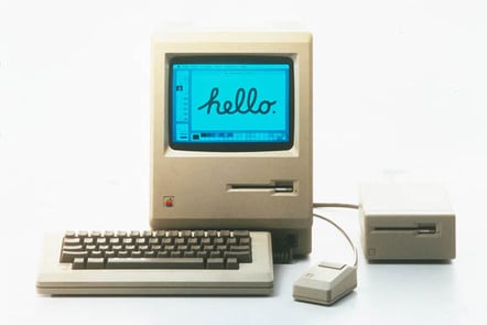
Apple launched the original 128 kB Macintosh around 40 years ago, and in so doing changed the computer industry, in ways that a lot of people still don't fully understand.
The original Macintosh was such a pivotal machine that, naturally, The Register has given it a lot of space. When it turned 20, we looked at how it was a mold-breaking computer. When it was 30, we devoted two separate installments to key points in the machine's history; and at 35, we looked back at its launch.
Even four decades on, though, there's still a lot of misinformation, and disinformation, about the Macintosh. It wasn't the first computer with a GUI. It wasn't a cut-down successor to the Lisa. It didn't replace the Apple II either. Indeed, it was several years before a Macintosh with a usable specification came along, and in the meantime, it was the Apple II that supported the company.
So let's puncture a few illusions.
The Macintosh was not the first GUI-based personal computer. Nor was the Lisa. It wasn't the Alto either – Xerox never sold that commercially. The first commercial GUI workstation was the Xerox Star in 1981, at a princely $17,000 – over $57,000 today.
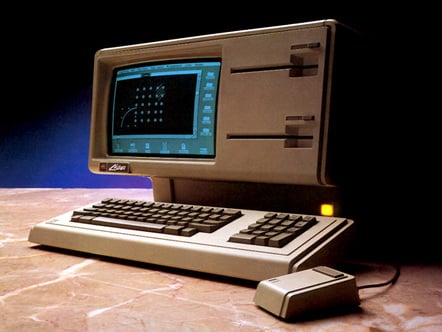
The Macintosh also wasn't a cut-down Lisa or "Lisa 2." In fact, there was a Lisa 2, and it launched at the same time as the Macintosh, as we mentioned when the Lisa turned 36. True, the Macintosh did take many elements from the Lisa's software design, but it's far from a copy.
The Lisa and the Macintosh both had five-year, and largely separate, development processes. The Lisa project began in 1978 and aimed to build a powerful business computer with a relatively conventional user interface, mainly text-based, although graphical and WYSIWYG in places. An example of the machine's versatility is that it could run other OSes, including Xenix, Microsoft's early Unix. In some ways, the Lisa as originally planned was more akin to the ill-fated Sinclair QL, which launched about two weeks before the Macintosh.
The Macintosh project began in 1979, just one year later. It was initially led by the late Jef Raskin, who set out to design a radically simple device more like an appliance than a computer. As Raskin's own history of the project recounts, the Macintosh was originally an eight-bit machine:
Raskin, originally hired to write Apple II documentation, had previously worked at Xerox PARC. It was Raskin that persuaded Steve Jobs to visit Xerox, and as the man himself said, Jobs missed two of the three most important things Xerox showed him, as we described when we examined the Xerox Alto at 50.
Jobs, left wealthy but without direct responsibilities by Apple's 1980 IPO, discovered the Macintosh project in 1981 and took over. Raskin, who planned an appliance rather than a general-purpose computer, resigned a year later. Raskin went on to design a very different machine for Canon – in its way, more radical, and closer to his original vision. The Canon Cat was a sort of intelligent, extensible word processor, programmed in Forth around principles Raskin called a humane computer.
Jobs returned from his first visit to Xerox PARC fired up, and returned for a second demo with some of the Lisa team. Incidentally, Apple didn't steal anything – it paid Xerox for the demos with 100,000 shares of pre-IPO stock.
Xerox's Smalltalk interface inspired the Lisa team to profoundly change their design, which they had been mocking up on the Apple II. Some before-and-after glimpses of the Lisa while in development can be seen in Rod Perkins' article "Inventing the Lisa User Interface" [PDF, but other formats are on the Internet Archive].
This 14-page account shows some of the key innovations that Apple invented from the whole cloth. Some, but not all, were inherited by the Macintosh, and some were more visible than others. For instance, Smalltalk had overlapping windows, but Apple's Bill Atkinson invented regions, a key algorithm that made them workable. Regions enabled programs to update a window even when it was partially covered by other windows, something the Xerox system couldn't do, and formed a key element of the Bouncing Pepsis demo that helped persuade Jobs' later nemesis John Sculley to join Apple.
- The rise and fall of the standard user interface
- For a moment there, Lotus Notes appeared to do everything a company needed
- ZX Spectrum Next Issue 2 ships out, chip shortages be damned
- At last: The BBC Micro you always wanted, in Mastodon form
Regions were a part of LisaGraf, the Lisa's graphics toolkit, later renamed QuickDraw. The Lisa's Pascal-based version was later rewritten in 68000 assembly to fit into the 64 kB ROM that Burrell Smith squeezed into the Macintosh.
It wasn't just implementation details of the Lisa's OS that were radical. When the Lisa turned 30, The Reg compared its desktop to the Alto, but a fairer comparison is the Star environment from a couple of years before the Lisa. Since the Alto, Xerox had come up with scrollbars and icons for documents, for instance. Even so, a lot of things visible in the Lisa's GUI were missing. The Lisa team invented things we all take for granted, such as menus that pull down from a menu bar and control buttons in window title bars.
If you try a Lisa or an emulator today, though, it is disorienting. The UI is built around documents. To create a file, you tear off stationery from a template to its desired destination. It's slightly similar to OS/2 2's strange Workplace Shell, launched nine years later. It's very different from the Macintosh's model of "applications" and "data files," already familiar in 1984 from Unix, CP/M, and MS-DOS.
Another of the Macintosh's simplifications was to have square pixels, rather than the rectangular ones of the Lisa – and IBM PC. Alongside the Macintosh's much simpler internal design, this was something else due to the design genius of Burrell Smith.

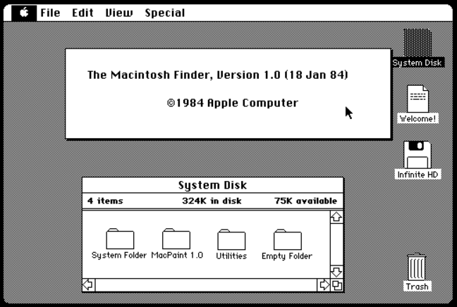
The Macintosh System, version 1.0. Already friendly, and still familiar
While the Lisa had 1 MB of RAM and a 5 MB hard disk, the original Mac had just 128 kB and one single-sided floppy drive. Lisa owners could drag-and-drop from application to filer window, but Mac users couldn't. Quite aside from its lack of multitasking, the Macintosh simply didn't have enough RAM to run both an application program and System 1.0's Finder at the same time. Instead, the Macintosh team invented standardized dialog boxes for loading and saving files, containing navigation tools so you could choose a location.
The Macintosh 128K was followed in September the same year by the Macintosh 512K, which came with half a megabyte and cost $2,795 – $8,245 today. Although Apple didn't endorse it, owners of the original machine could get the same by replacing their 64 kb RAM chips with 256 kb chips, thanks to memory upgradability that Smith sneaked in.
Two years after the original Macintosh, Apple finally launched a credible, useful model, the Macintosh Plus. This cost $2,599 – about $7,250 in 2024 – and came with a double-sided, 800 kB floppy drive, 1 MB of RAM (in four SIMM slots, for easier upgrades), and critically a SCSI port, making it relatively easy – if not cheap – to add an external hard disk. These things, in turn, required a larger, 128 kB ROM, both for device drivers and the new Hierarchical File System.
It took two years to get there, but the Mac Plus marked the point at which the Macintosh started to become a serious machine – and indeed to finally outsell the Apple II. In many ways, the original Mac was cut down too far to be practical – although with an external floppy drive people did amazing things with them. On the other hand, its relative affordability helped it to get noticed, and its spec forced its designers to feats of ingenuity that set trends we still follow today.
Apple's Human Interface Guidelines also set the direction of the software industry for years to come – even if indirectly. The researchers at Xerox showed the way, but it wasn't the Lisa that inspired four decades of software designs. It was the humble 128K Macintosh. ®
From Chip War To Cloud War: The Next Frontier In Global Tech Competition
The global chip war, characterized by intense competition among nations and corporations for supremacy in semiconductor ... Read more
The High Stakes Of Tech Regulation: Security Risks And Market Dynamics
The influence of tech giants in the global economy continues to grow, raising crucial questions about how to balance sec... Read more
The Tyranny Of Instagram Interiors: Why It's Time To Break Free From Algorithm-Driven Aesthetics
Instagram has become a dominant force in shaping interior design trends, offering a seemingly endless stream of inspirat... Read more
The Data Crunch In AI: Strategies For Sustainability
Exploring solutions to the imminent exhaustion of internet data for AI training.As the artificial intelligence (AI) indu... Read more
Google Abandons Four-Year Effort To Remove Cookies From Chrome Browser
After four years of dedicated effort, Google has decided to abandon its plan to remove third-party cookies from its Chro... Read more
LinkedIn Embraces AI And Gamification To Drive User Engagement And Revenue
In an effort to tackle slowing revenue growth and enhance user engagement, LinkedIn is turning to artificial intelligenc... Read more


