GoDaddy Websites + Marketing: A No Muss, No Fuss Website-building Service
Do you need to be a geek to build your own website? Makers of website builder software say the answer to that is "no." They contend that, if you can choose items from a menu, fill out some forms, and write some copy, you can have a website every bit as professional as if you hired an agency or taught yourself to become a WordPress guru.
In the following article, we put that claim to the test.
First, a disclosure: I am one of those geek WordPress coders; I program my own plugins, run about 10 websites, and have been building and operating websites since, well, since there were websites. But today I am slipping my feet into the shoes of those folks I've helped in the past to get their sites up and running.
The website builder we are reviewing this time is GoDaddy's Websites + Marketing service. This service, as you might imagine, offers websites with marketing tools. [Another disclosure: I've been a GoDaddy domain customer for many years, and GoDaddy provided me with a temporary test account to do this review.]
How we test GoDaddy's service
Normally, when I review a hosting provider, I look at a lot of specs and stats. I compare version numbers of core libraries they're running. I do performance tests. I look at their integration of complex control panels and whether or not website operators can run command-line queries. All that is just so much jargon to the website builder customer.
So here, I'm going to test the service by trying to build three different types of sites:
- A brochure-style site with company info, an "About" and "Contact Us" page, and a portfolio of successful projects
- A restaurant site with a menu
- A landing page site with a buy button
Please note that to do this test, I asked GoDaddy to equip me with its lowest-end web builder plan, the Basic plan. This plan is available for $6.99 a month if you prepay for 12, 24, or 36 months. When you renew at the end of your prepaid period, the price jumps to $10 a month.
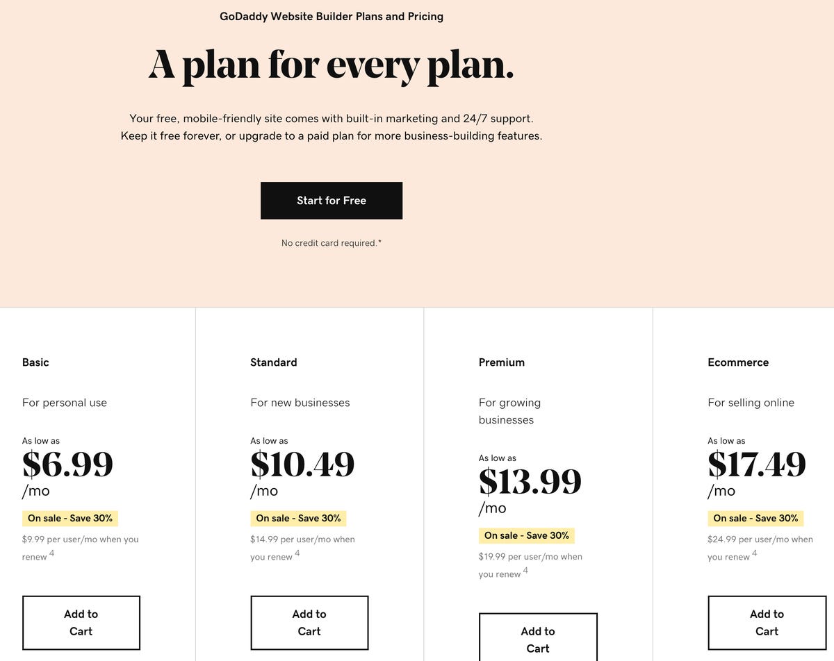
I usually like to test the bottom tier plan first, because that's what the majority of customers will buy. While GoDaddy does offer plans with full ecommerce integration, the Basic plan doesn't have much. If enough of you are interested, maybe I'll circle back and do a separate dedicated review of the ecommerce offerings. GoDaddy also has a free plan, but because it doesn't allow you to have your own domain name, I've disqualified it as a contender for any business-level promotion.
There are a few objective tests I performed for this builder site. I looked at whether the site comes with SSL setup. That's the https you see at the beginning of URLs. It indicates a site is encrypted and is now table stakes for getting good Google juice. Google now penalizes non-encrypted sites.
I also tested the site designs for responsiveness. Responsiveness is geek buzz for making sure a site resizes elegantly for mobile readability. With so many people visiting sites from their phones, you want a properly responsive site.
I also took a quick look at elements that often impact SEO (search engine optimization) results. SEO is a giant rabbit hole you can fall down, so I don't want to spend too much time on it. But since GoDaddy says this is as much a marketing service as a website service, it will be instructive to see what they offer on their basic plan.
And, finally, I ran some performance tests. No matter how cheap a site is, it has to be able to feed pages quickly. We'll find out if the entry-level tier will give your customers information when they want it, or make them waaaaaaaaait untiiiiiiiil thhhhhhhhe paaaaaaage loooooooooads.
Getting started with the Toy Glory site
As soon as I was assigned an account, I received a welcome email:
I clicked on the Create My Site button and logged into GoDaddy. At this point, I was presented with a helper page.
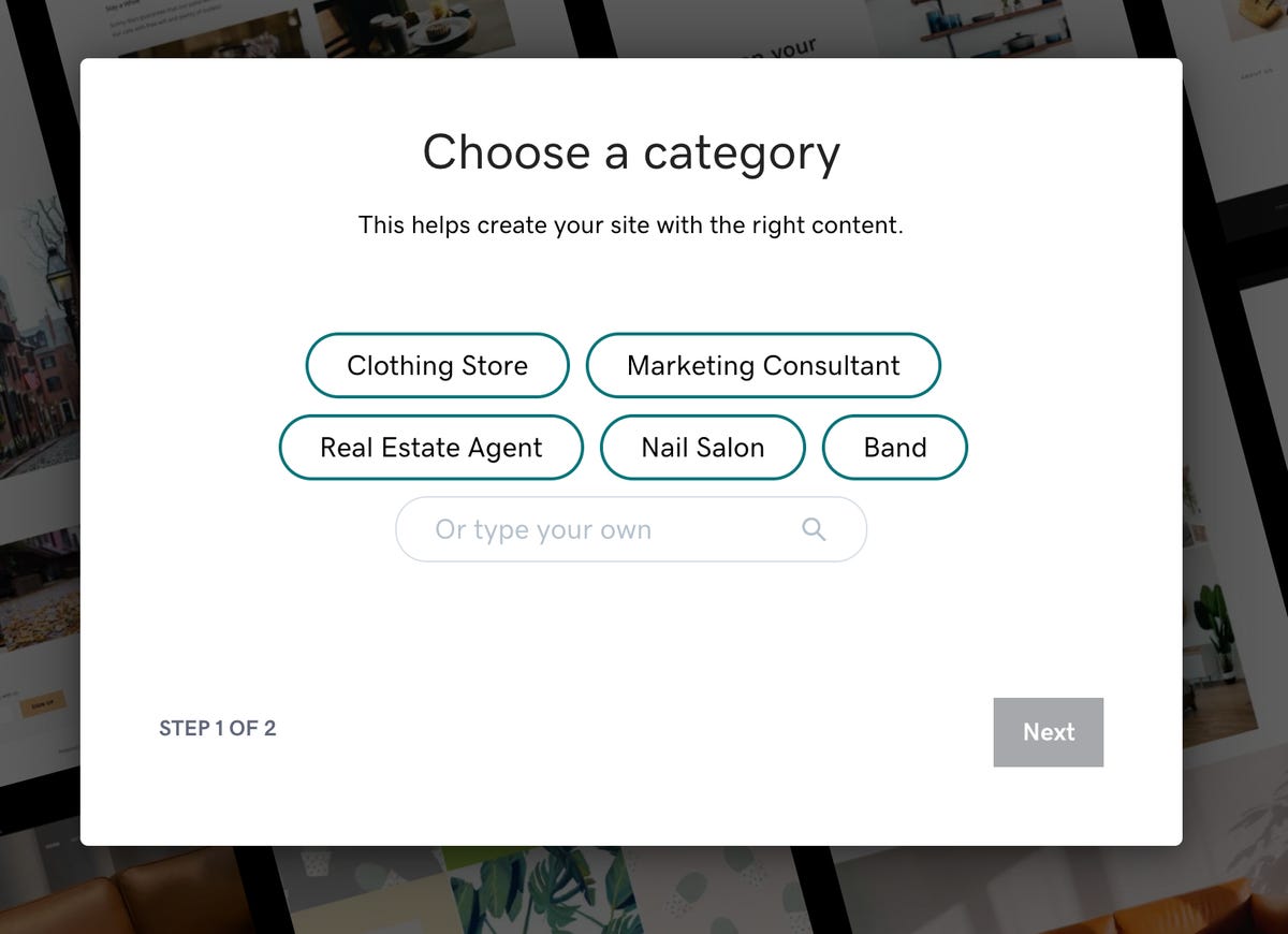
Unfortunately, I'm not building a site in any of those categories. For our first site, we're going to build a brochure site for a toy appraiser. Aside: I don't know if there's such a business, but Unsplash.com has some awesome pictures of toys, so we're using it as our example. We'll call this made-up company that evaluates the value of toys Toy Glory.
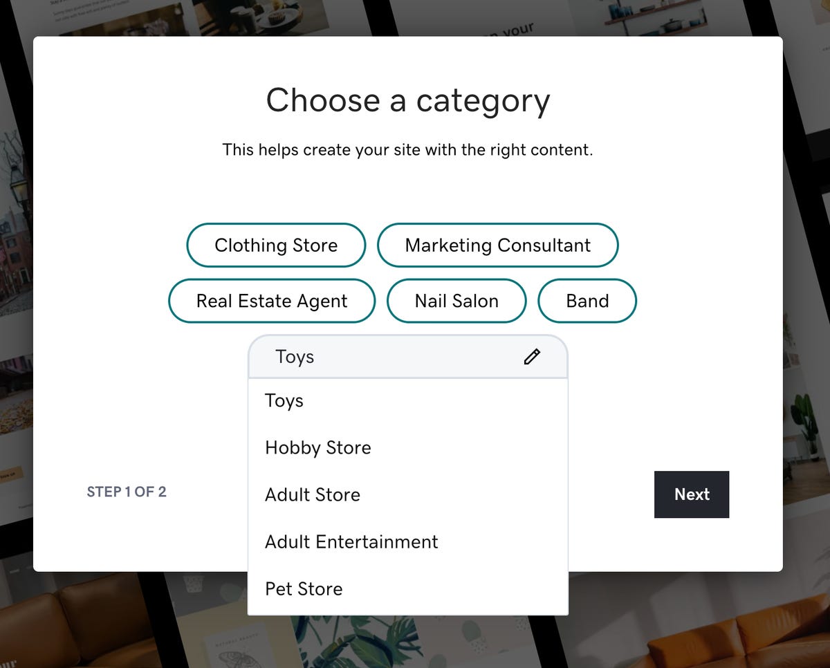
I went ahead and typed in "toys" as my category. As you can see, there's a Toys category (as well as, um, a few others):
Next, we have to give the site a name. I called it Toy Glory:
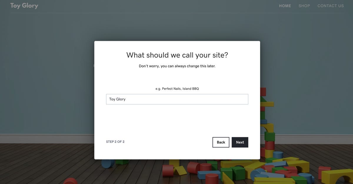
Notice the dimmed-out background. Toy pictures. Cool. The builder actually knows what we're talking about in terms of the site's focus. I went ahead and hit Next. At this point, I was dropped into the site editor. I like that it already suggested a relevant tagline. Because this is a test site, I didn't bother with giving it an original domain. For now, I'm using toyglory.godaddysites.com.
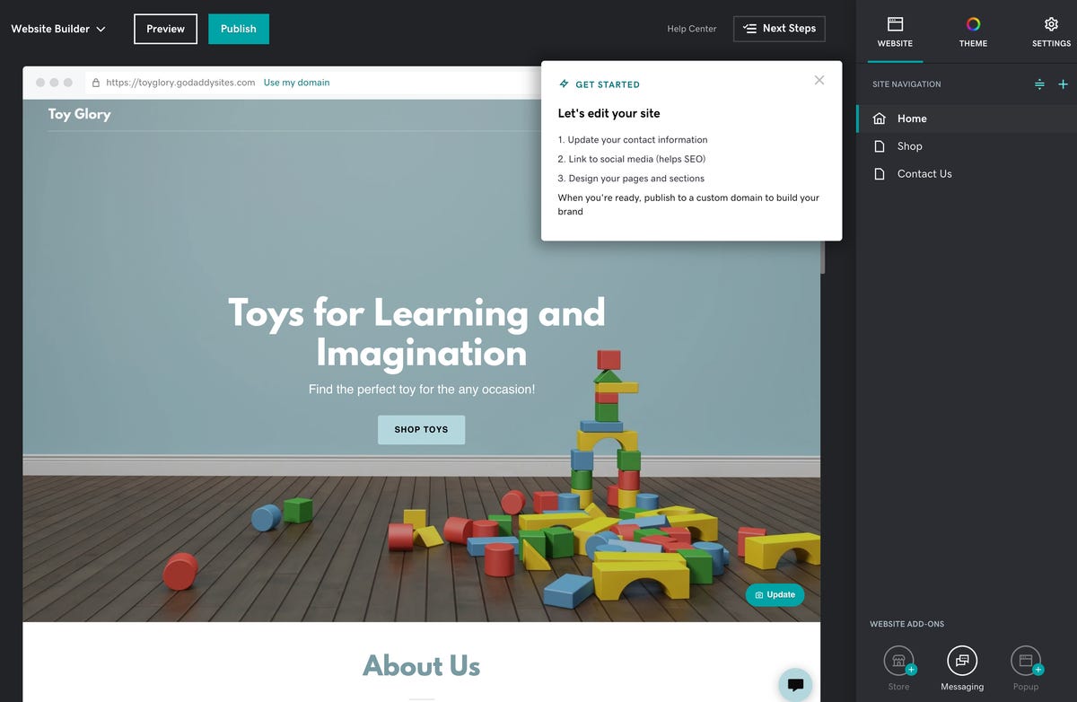
There's a lot to take in here. But since we've never used this service before, we're going to start with Next Steps:
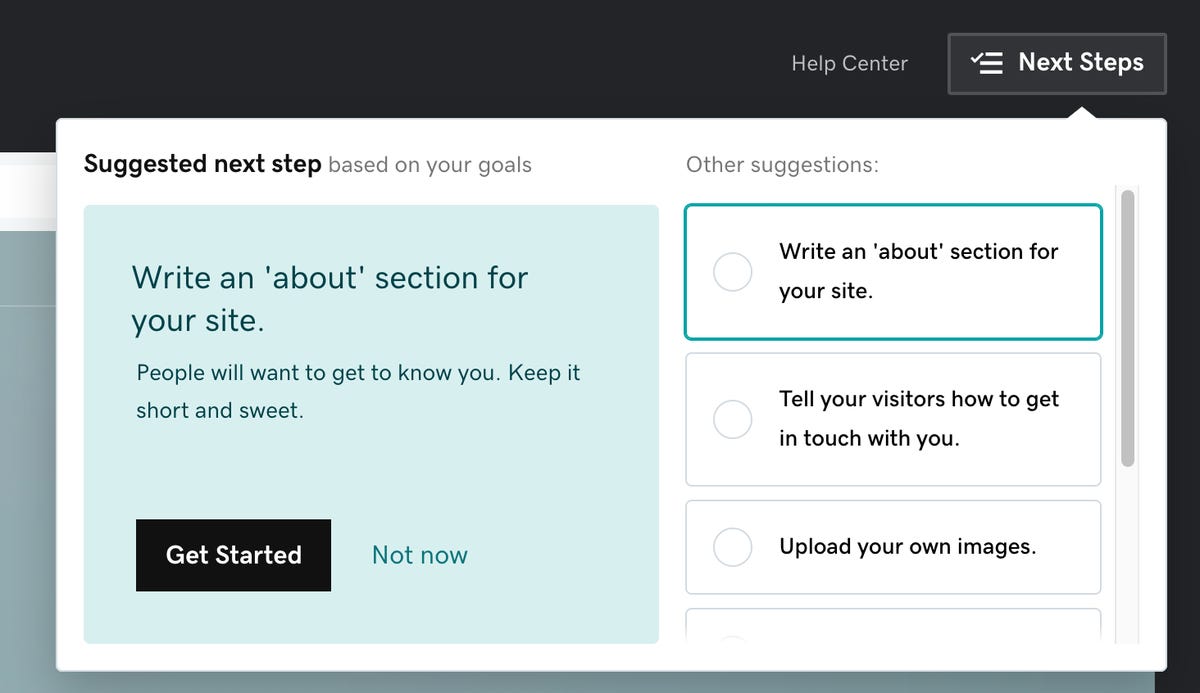
OK, an about section is clearly something we want, so let's press Get Started. Hmm... The site was set up to be a big, long, scrolly page. About Us was just below the main picture. Below that, on the same page was Photo Gallery, Events, Reviews, Keep in Touch (an email sign-up form), and Social (with the usual links to the social media accounts).

I didn't envision a big long scrolling page when I wanted an about page. So let's see what's involved in adding a new page. On the right is a Site Navigation section, with a plus sign. I hit that.
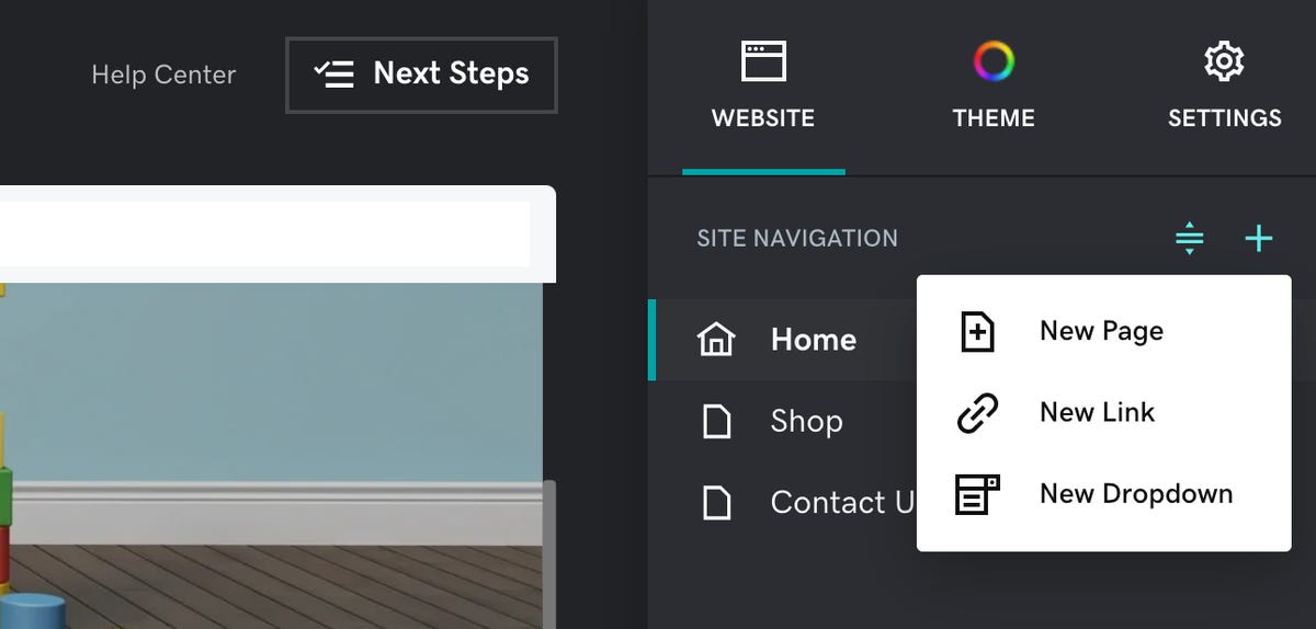
Ah, there we go. I added a new page. That's more like it:
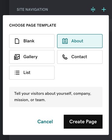
I chose the About template and press Create Page. It presented me with a page, complete with some cool toy-related pictures. For the sake of our test, I decided to just go with the main picture. But I wanted a few pictures of the founders, which I added below. Let's see how that worked.

At the point of editing, there's not much font control. But if you hit the Theme button, you then have a wider variety of font families to choose from:
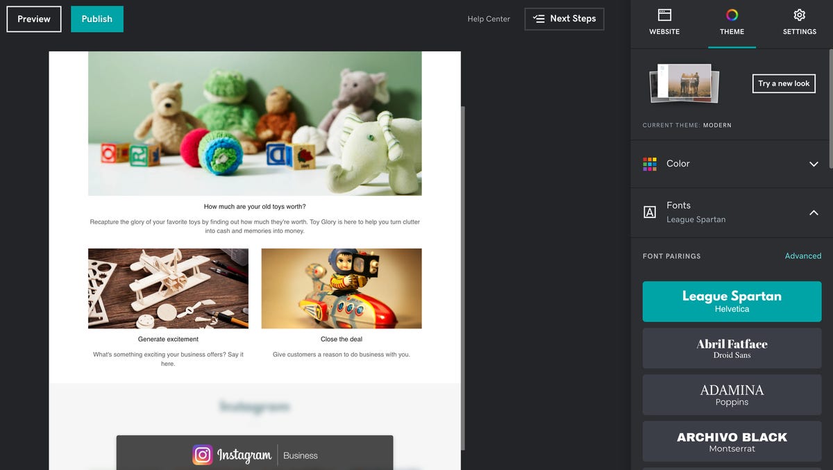
I liked Poppins as the headline font, bolded, and the rather generic Open Sans as the body font. Oh, that's better:
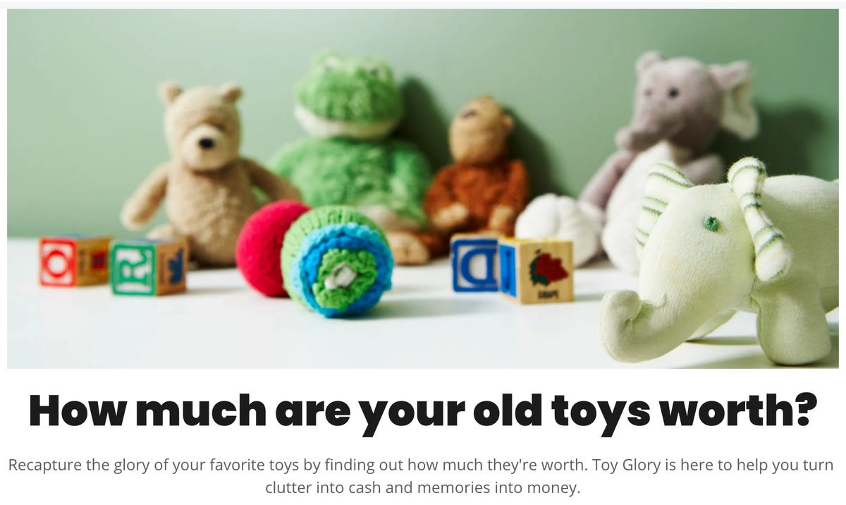
Below that are two images, which come with the layout for this page. The only problem is I want three images, for three founders.
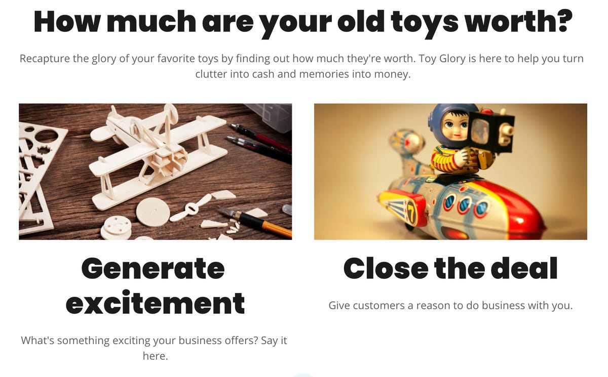
As it turns out, you can change the look. All you need to do is go to the Layout item and click the tiny little right arrow. So, here's my first "ding" against this product. It's easy to choose the style you want after hitting the arrow, but I'm not sure that novice users will know to click that arrow to change up the layout.

Also, hitting that arrow and changing the layout changes what's already been added to the page. It changes the look of the entire section. If you really want the image above "How much are your toys worth" and then three founder images, you have to take a few steps that also might not be intuitive to novices. Here's how.
First, hover over the two unwanted images and hit the trash icon:
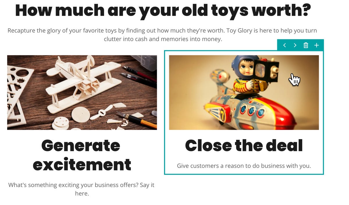
Well, that was a little disconcerting. There was one wide image, and two more images side-by-side. I deleted the right side image, and the layout reformatted to put the main image and the remaining side image side-by-side. I then deleted the second unwanted image, and the layout snapped back to just the main image. But here's the thing: There doesn't appear to be an undo [Update: there is a capable undo-like History feature, more on that later]. Unfortunately, the Help Center link up at the top of the page doesn't appear to do anything.
I finished up the About page. It came with a bunch of sections that I didn't want. Hovering over the sections didn't present a trash can, but if you click the three dots, there is a Delete Section option, which I used.
Next, I went ahead and added the founders photo section. To do this, you hover over a section you want to add something below and hit the plus button. That drops you into a rather rich library of item types and styles. I grabbed the three circles section by hitting Add.

The image editing and placement capabilities are pretty good. Not only can you easily resize and change the shape of the image area, but if you click the pencil you're dropped into a full-fledged image editor that does all the usual image retouching operations you'd expect.
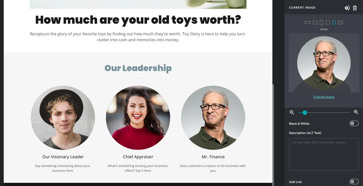
Toy Glory's leadership images were brought to you by Unsplash users Ian Dooley, Michael Dam, and Foto Sushi.
Wrapping up Toy Glory
And that finishes up what I wanted on the About page. Hitting Done and then Preview gave us a look at the page in both desktop and mobile format.
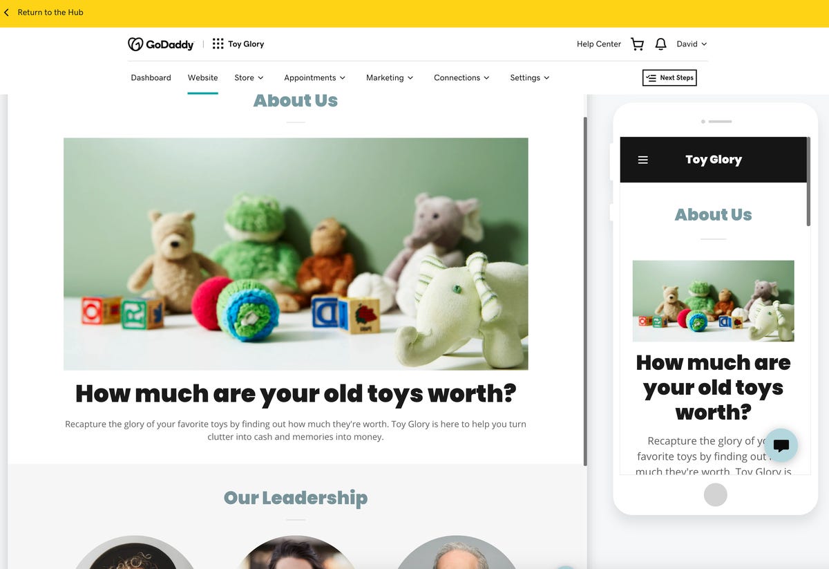
Because this is a brochure site and we wanted a portfolio, I went back to the site navigation section, hit the plus button for a new page, and selected Gallery. I was not super thrilled with the gallery layout choices, but that's because I'm fussy and am used to flinging my own CSS. For someone who wants to click one or two buttons and get a gallery, this was painless:

All told, that's not bad. Creating the rest of the site was a matter of adding more pages, adding and removing sections, choosing pre-built modules, and writing the appropriate copy.
I went ahead and published the site and was happy to see that it included a Cookies disclaimer, as well as a little "contact us" icon on the bottom of each page. That's a nice, professional touch. Also, keep in mind I just used the default theme. Other than making one font change, the site is about as "what comes in the tin" as possible. I didn't have to make any design decisions to come up with a viable site.
Also, it's worth noting that the site published with a valid lock icon, and https works automatically. If you use your own domain, there will be some fiddling around, but I generated a secure site simply by pressing Publish. Thats' a win.
Performance testing Toy Glory
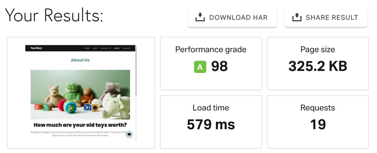
First, I ran two Pingdom Tools tests, one hitting the site from Washington DC and the second from Germany. Here's the DC test rating:
And here's the same site from Germany:
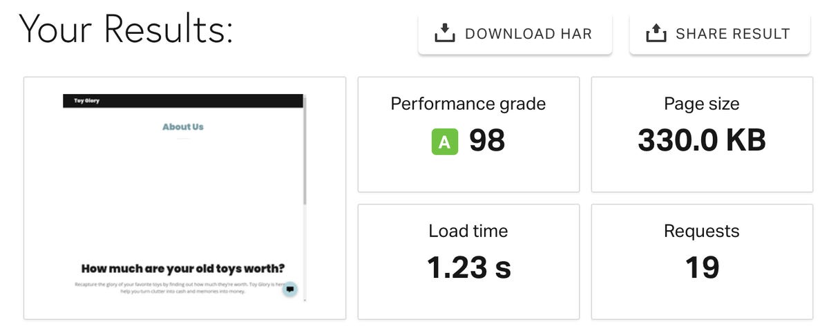
And that's a ... Wow. I've very rarely gotten a 98 Pingdom grade on any site I've tested. Ever. Granted, this is a simple site, but still. Wow. To cross-check the results, I ran a similar test using the Bitchatcha service:
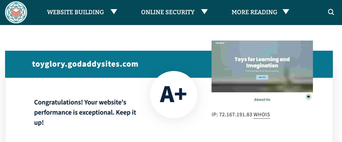
And... wow, again. I have no complaints about site performance. That's really good.
Building a restaurant site
One of the ways my wife and I helped ourselves stay healthy was with a mantra we decided on early in the pandemic: Always be roasting. This was to make sure we always had fresh (or sometimes frozen) roasted vegetables to eat with our meals, as meals, and sometimes as snacks. Turns out that roasting cauliflower with Old Bay rocks.
Anyway, in honor of our moderately herbivorous aspirations, we'll name our example restaurant Always Be Roasting. Beyond selling roasted items, Always Be Roasting has two interesting characteristics: It's a virtual kitchen, without customer seating. And it delivers its food using an army of tame robots.
Backups, site nuking, and restore
Since my web builder plan only has one website, we're going to need to nuke Toy Glory to create Always Be Roasting. This is where we talk about Websites + Marketing's powerful History feature. If you dig under the Settings icon, there's a Site History option. If you tap into it, you'll see a list of site snapshots, which were automatically taken by the builder when there were major changes to the site. This is very helpful, especially if you delete a section (or a site) you didn't want to.
At the top of the menu is a Create Backup button located very dangerously near Reset Website.

To test the worst case, I very carefully hovered my mouse over Create Backup and clicked it. A new snapshot was created. Now here's where it gets interesting. I decided to completely reset my site, with a new name and even a new domain, setting it up in the Restaurant category instead of Toys.

I quickly created the new site (overwriting Toy Glory completely):

The builder gave me an entirely new website. It had none of the features I'd added in the previous version. It was a fresh website. All well and good, but this tool is meant for non-geeks. There should be a way to undo such a catastrophic decision as clicking "Yes, start over." And there was. I went back to Settings and History, scrolled down to the backup (in this case, I took a manual backup before nuking the site), and hit that magic Restore link:
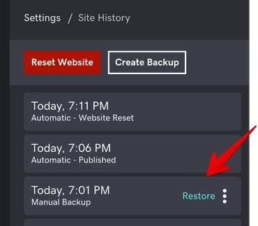
Within a minute or so, the entire old site was fully restored. This is a standout feature.
Creating Always Be Roasting
Now that I had a chance to test divine intervention, it was time to quickly spin up a test restaurant site. I did the reset, chose Restaurant as my category, and named the site Always Be Roasting. This time, though, I wanted to choose a new theme. I hit the Theme icon and scrolled through the list. I chose Trade because I liked the text square in the middle:
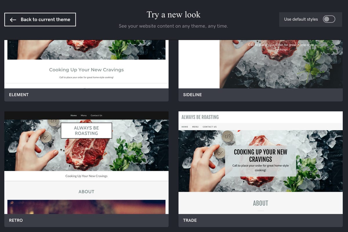
Here's where the category choice gets interesting. I wanted to add a menu to my site but figured I'd have to dig through the new section list and find something appropriate. But as you can see, the site comes with a working menu by virtue of merely choosing the Restaurant category. Cool.
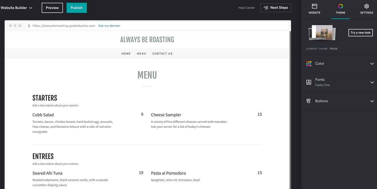
Well, that was quick. GoDaddy's Websites + Marketing can easily build a basic restaurant site. Note that this is just a site with a menu. It is not an online ordering site or one that connects to a delivery service. That's a test for a more advanced service. But if you have a restaurant and you want a nice-looking site created quickly, it doesn't go much quicker.
Creating an ecommerce squeeze page
There's no doubt in my mind you've seen squeeze pages before. In ecommerce, a squeeze page is generally a relatively long, single-page site, with lots of details, sections, and sales pitches. This page is usually presented as the landing page after some kind of ad or promotion is clicked on. The goal of the squeeze page is often lead generation and sales.
Websites + Marketing does not offer a site category called "squeeze page," although they do offer an ecommerce category, so I chose that. Now, I'm fully aware that there's a much higher-priced plan for ecommerce, but I wanted to see whether it was possible to sell anything on the very basic most plan.
The whole purpose of this example site is to market COVID-19 masks for Teddy Bears. I chose that product for our example because I ran across a great masked Teddy Bear picture by user L_N on Unsplash. My test site is called Masked Teddy Bears. Because I can.
As it turns out, you can't add a section called "Online Store." If you do, you'll get an upsell message. We expected this because this plan doesn't have ecommerce.
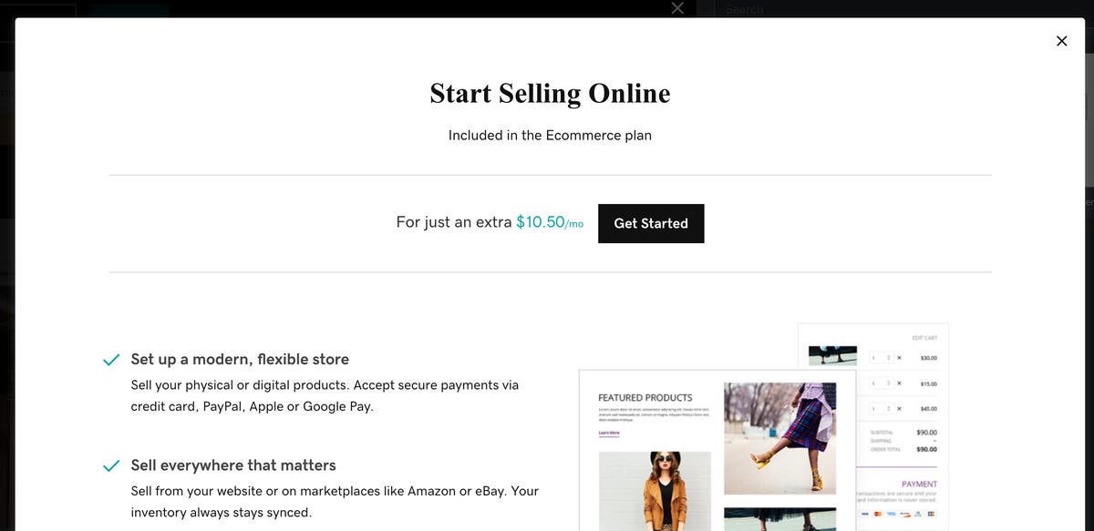
That said, the site offers a Fundraising type, which accepts donations via GoFundMe. It offers a Gift Card option, where your site visitors can purchase a digital gift card via Square or Give Up! Finally, you can sell a product using the PayPal button option, which is what I opted to use.
Getting it set up
The first thing I did was go to the Site Navigation area and delete the Shop, Contact Us, and About Us pages. This gave me a single page. The builder also smartly removed the menu items for the pages I deleted. Then I uploaded the image, changed some of the text, and even gave it a compelling tagline.
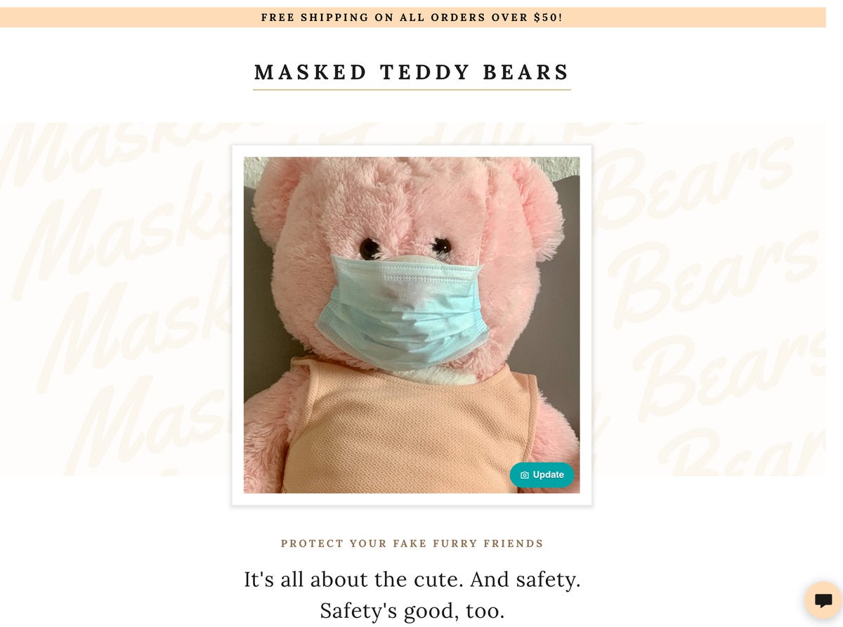
Note the "free shipping" promo ribbon and the contact us button in the corner. Both came automagically as part of the category selection. Another thing that came as part of the category selection was the email list signup section. The list is managed inside of the builder dashboard, and GoDaddy offers a wide range of email marketing solutions you can use with the list.
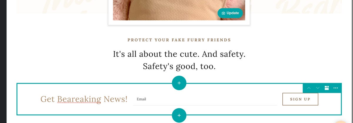
Finally, it was time to add the buy now button. I clicked under the email section and clicked Add Section. Scrolling down the section list, I chose PayPal Button and then chose to sell a product or service.
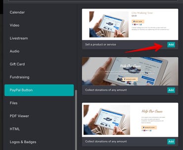
Once the section is in place, it's a quick matter of putting in a product picture, choosing a price and shipping fee, and adding any other appropriate text. At the very bottom of the right-side menu is an option for PayPal settings, which is where you're able to either enter your PayPal account details or create a new account.
And there we go. A product sales squeeze page that was pretty easy to produce. Now, be aware that this doesn't have shipping tracking, inventory control, tax management, and the myriad other features a full online store should have. But if you want to take orders for bear masks, you can.
Pros and Cons
Overall, GoDaddy's Websites + Marketing met my test criteria. I was able to set up the three different sites I wanted, along with the specialty features (like email capture, a menu, and product purchasing). So with that, let's look at the winners and losers:
Pros
- It works. Always a win.
- Category setup is surprisingly smart and helpful.
- The History feature is more powerful than expected.
- It has good in-browser image editing.
- Holy Toledo, Batman! It's fast.
Cons
- Theme selections are usable, but nothing to write home about.
- The needed capabilities are there, but many are going to be hard for novices to find.
- Help Center button non-responsive and overall GoDaddy navigation is somewhat obtuse.
Final thoughts
Look, as I said, this is not a product I'd probably use. I find the fact that I can't drop into SSH or write my own code for the site somewhat unsettling. But I'm not the target prospect for this service. I have worked with a lot of folks who are the target prospect, and I have to say that for seven to ten bucks a month (depending on whether you're in your first year or you've renewed), there's a lot that's provided.
The service checks off all the must-have boxes. It's fast, which is very good for Google juice. It's automatically SSL protected, also good for SEO. It's got a comprehensive history feature which can protect you from some very bad mistakes. And it provides most of the needed capabilities to get started in just a few hours.
Total newbies might be a bit baffled by the interface, but once learned, it's very easy to use. I won't tell you this is the best web builder because that's a very subjective statement. But I will tell you that it does its job well, without causing tears. And when it comes to technology, what more can you ask?
Also, before we end, I wanted to tell you about a free website developer and designer virtual event GoDaddy is hosting next week. It's called Expand 2021 and it's all about building up your online business. There's going to be some discussion of GoDaddy's Pro service, but the bulk of the event is about promotion, marketing, and site operation tactics. For free, I feel confident point you to it if you want to level up your site management and marketing knowledge.
So, what about you? Do you run your own site? Do you use a web builder, something like WordPress, or do you code your own HTML by hand? Let us know about your site and what's cool about it in the comments below.
Additional reading:
- WordPress site 101: Free and low-cost tools to build a powerful web presence
- One developer's favorite Mac coding tools for PHP and web development
You can follow my day-to-day project updates on social media. Be sure to follow me on Twitter at @DavidGewirtz, on Facebook at Facebook.com/DavidGewirtz, on Instagram at Instagram.com/DavidGewirtz, and on YouTube at YouTube.com/DavidGewirtzTV.
Reassessing AI Investments: What The Correction In US Megacap Tech Stocks Signals
The recent correction in US megacap tech stocks, including giants like Nvidia, Tesla, Meta, and Alphabet, has sent rippl... Read more
AI Hype Meets Reality: Assessing The Impact Of Stock Declines On Future Tech Investments
Recent declines in the stock prices of major tech companies such as Nvidia, Tesla, Meta, and Alphabet have highlighted a... Read more
Technology Sector Fuels U.S. Economic Growth In Q2
The technology sector played a pivotal role in accelerating America's economic growth in the second quarter of 2024.The ... Read more
Tech Start-Ups Advised To Guard Against Foreign Investment Risks
The US National Counterintelligence and Security Center (NCSC) has advised American tech start-ups to be wary of foreign... Read more
Global IT Outage Threatens To Cost Insurers Billions
Largest disruption since 2017’s NotPetya malware attack highlights vulnerabilities.A recent global IT outage has cause... Read more
Global IT Outage Disrupts Airlines, Financial Services, And Media Groups
On Friday morning, a major IT outage caused widespread disruption across various sectors, including airlines, financial ... Read more
